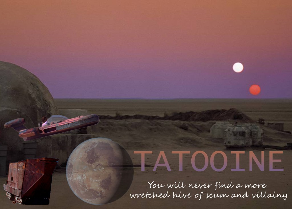
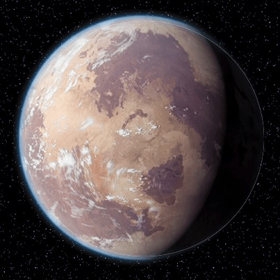
I used a gradient to make the word “Tatooine” look like the sunset. I changed the opacity of the picture of the planet. The contrast in my text is that one word is a print font and the rest of the text on the card is a script font.
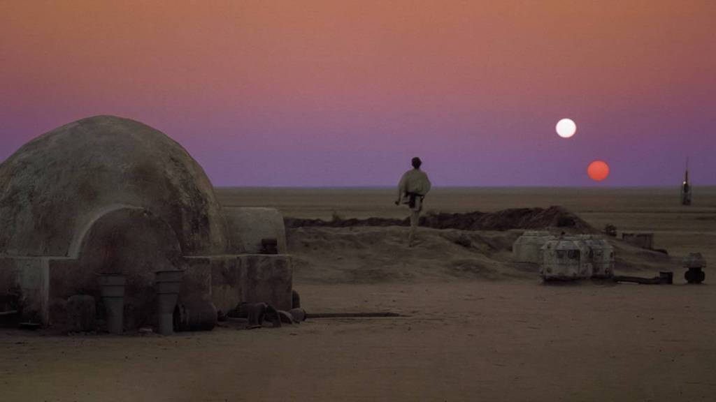
I used a gradient to make the word “Tatooine” look like the sunset. I changed the opacity of the picture of the planet. The contrast in my text is that one word is a print font and the rest of the text on the card is a script font.

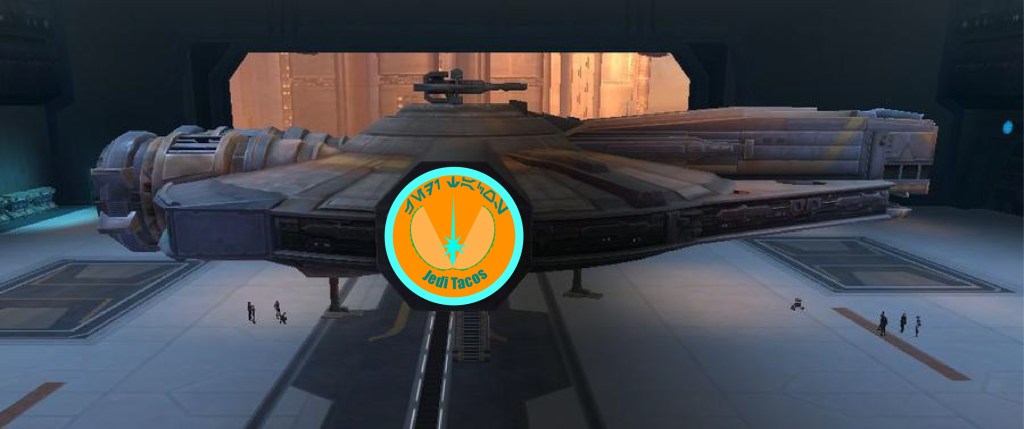
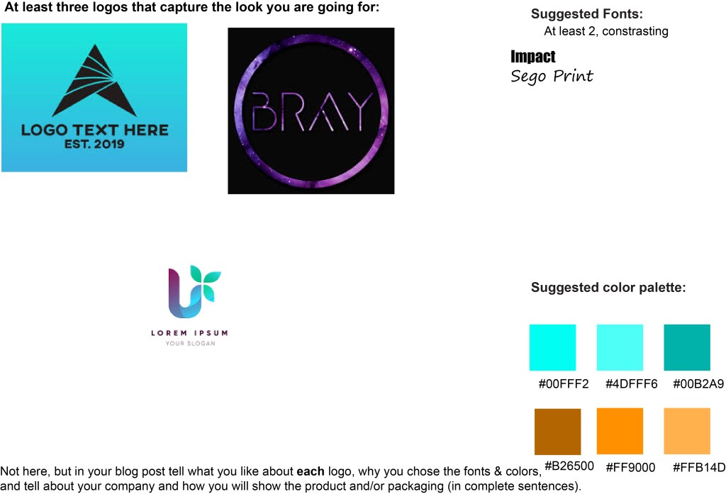
I like the first logo because of the simple yet futuristic look. I like the second logo because of the space look. I like the third logo because of the colors. My company is a taco freighter in the Star Wars universe called Jedi Tacos. I will show my logo on the freighter that sells the tacos. I chose the colors because they are the colors of the Jedi logo and my taco freighter is Jedi themed. I chose the fonts because they remind me of the fonts used in Star Wars.
